Project
Food For Thought is an interactive Tableau data visualization that explores popular meal choices worldwide, provides details on nutritional content, and facilitates cross-regional comparisons. The project was developed during my Human Centered Design and Engineering Masters program at the University of Washington for the HCDE 511 Data Visualization course.
Challenges
Can we create an informative and satisfying interactive data visualization using tools and concepts that are new to us?
Can we use Tableau’s tools to create a navigable interface?
Role
I played a significant role in the project as a sketcher, paper prototyper, Adobe XD interactive digital prototyper, Tableau interface and interaction designer, graphic designer, and contributed substantially to writing and editing the project documentation.
Process
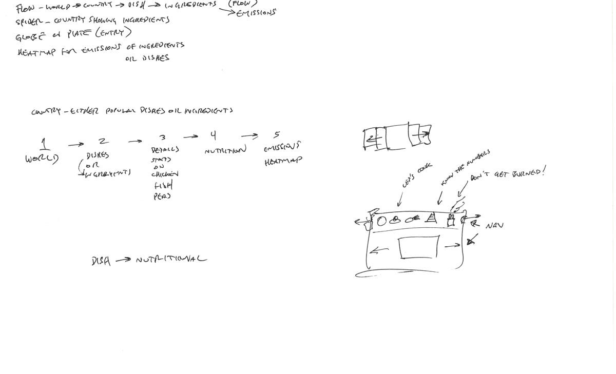
We started with a dataset about food and recipes, and ideated about exploring cultures through the context of food. We sketched blue sky ideas and narrowed down to interesting types of data visualizations. Then, we combined our sketches into a whole and came up with a possible progression.
I contributed graphical elements, lists, navigation, and a representation of the world as an interface, which were all part of the final piece. We also wrote down ideas on what types of interactions, operations, and tasks would be occurring at each point, and what types of data might be needed. We combined two datasets, using images from one of them. I tracked down open-source graphics of maps and created others from scratch using Photoshop and Sketch.
Sketches
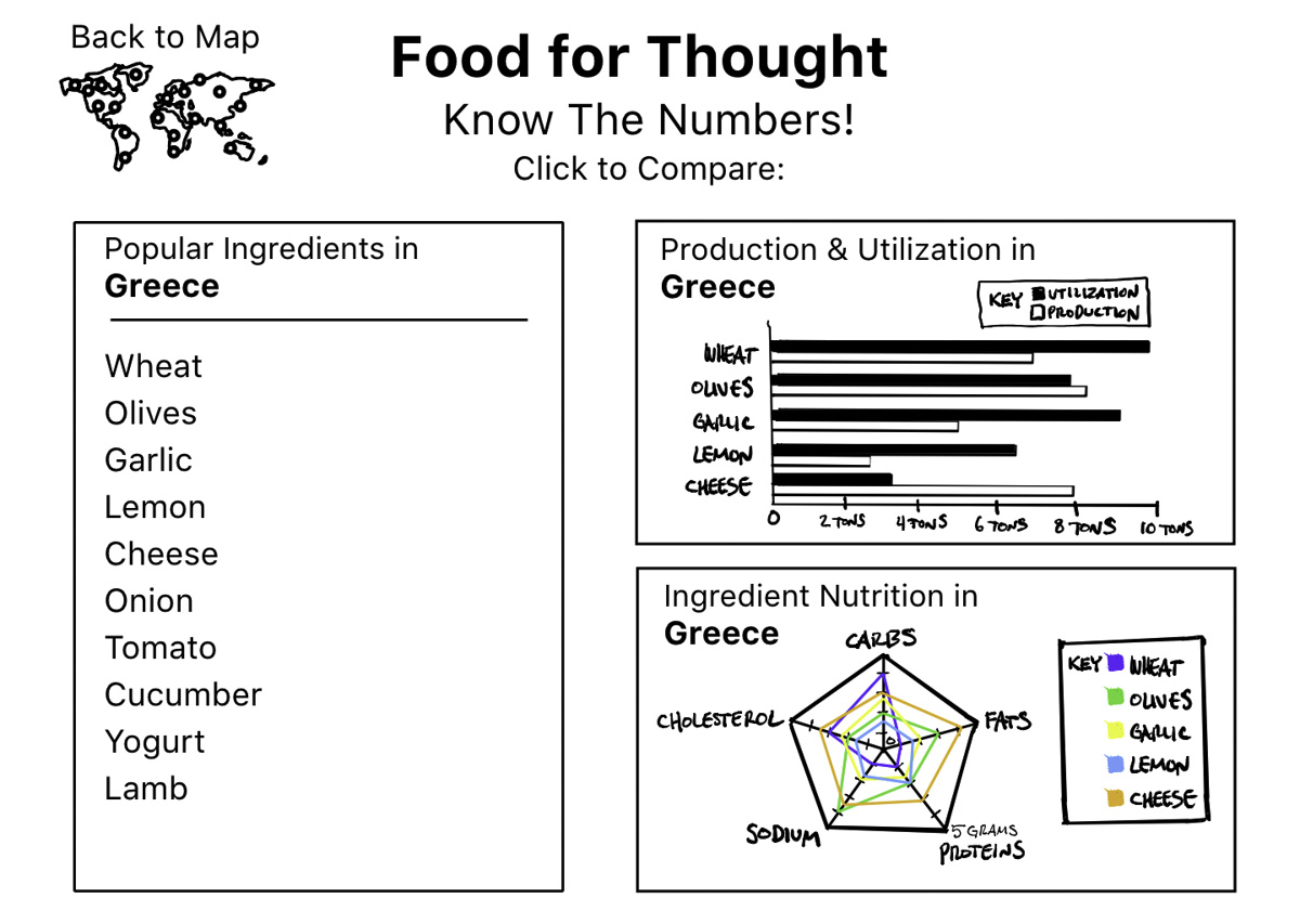
Paper Prototype: I sketched interface elements and created a clickable prototype using Adobe XD to test our ideas. Each team member conducted early usability tests to identify what worked for our users and what needed improvement. The prototype was low fidelity, which allowed us to explore different ways to visualize data and navigate between data representations. We also created additional elements that users could change by tapping with the back of a pen. We conducted basic usability testing to understand users’ expectations and what information they expected to see when they selected different elements.
One of my initial sketches included a pie chart that would display percentages of ingredients using graphics. For instance, if corn made up 25% of a recipe's contents, the pie chart would show one-fourth of the chart filled with an image of corn kernels and a label indicating "Corn 25%". Unfortunately, our data did not provide enough information to implement this. For the final visualization, we decided to show a list of the common ingredients in the selected region and their rank in recipes.
Paper Prototype
Low Fidelity Prototype: I developed an interactive digital prototype using Adobe XD and my iPad drawings. This allowed us to conduct usability testing individually. We received valuable feedback and new ideas to try out.
Click the image below to interact with the Adobe XD prototype!
(desktop browser required)
Low Fidelity Prototype
Low Fidelity Prototype Screenshots & Adobe XD Screenshot
Learnings & Future
Data and Data Wrangling: We documented a great deal in the future section, mostly concerning the manual cleaning of our data. I had to manually convert, resize, and create our graphics. Although we would have loved to include a larger dataset in our visualization, manual labor was our limiting factor. If we were to continue this project, automating data cleaning, conversion, and graphic creation would allow us to use a larger dataset.
Navigation: In future work on this project, I would like to redesign the navigation. The current navigation is somewhat novel but not as intuitive as using the top bar as more of a navigation bar and enabling a linear progression through the experience. This would allow us to include forward and back buttons, which would likely reduce confusion. We also want to include more navigation and interaction using the actual data elements, such as clicking on a bar of a bar chart to get information relevant to that click.
Tableau: Our team was new to Tableau, and we had to learn not only how to use the software but also what was possible with it. Tableau was also a moving target, as we had multiple software updates during the project, one of which enabled functionality that we used in our final data visualization project.
New Tools: Our team was new to Tableau. This was a learning experience not only for learning how to use the software, but to also learn what was possible to do with it. Tableau was also a bit of a moving target, as we had multiple software updates during the course of the project, one of which enabled functionality that we used in our final data visualization project.
New Concepts: As this data visualization was for a class learning how to do such things, we were all exposed to new ideas and possibilities. Some of our team members had exposure to data visualization, but not all of the concepts. This led to situations where someone knew of a type of visualization or mathematical analysis, but some were not possible in Tableau or were too complicated to get working in a short time span, and some required additional software.
Databases: We began our project by exploring the world food database we used, and then sketched out potential visualizations based on our understanding of the data. Some of our ideas required more data than we could locate. The data available limits or expands the ideas or concepts that can be illustrated. If we continued working on this project, our team agrees that finding additional data on world food production, usage by country and region, occurrence of foods in recipes, and dietary specifications of each ingredient and meal would have enabled a broader scope of data visualization.
Outcome
In its final form, our interactive Tableau data visualization is intuitive for users to navigate, functional, and provides insights into food, cultures, and the world.
Final Visualization
Note: The top tab bar in the final prototype is required to be shown in order to enable some of the navigation features that we used. Ideally, this would not be visible.


