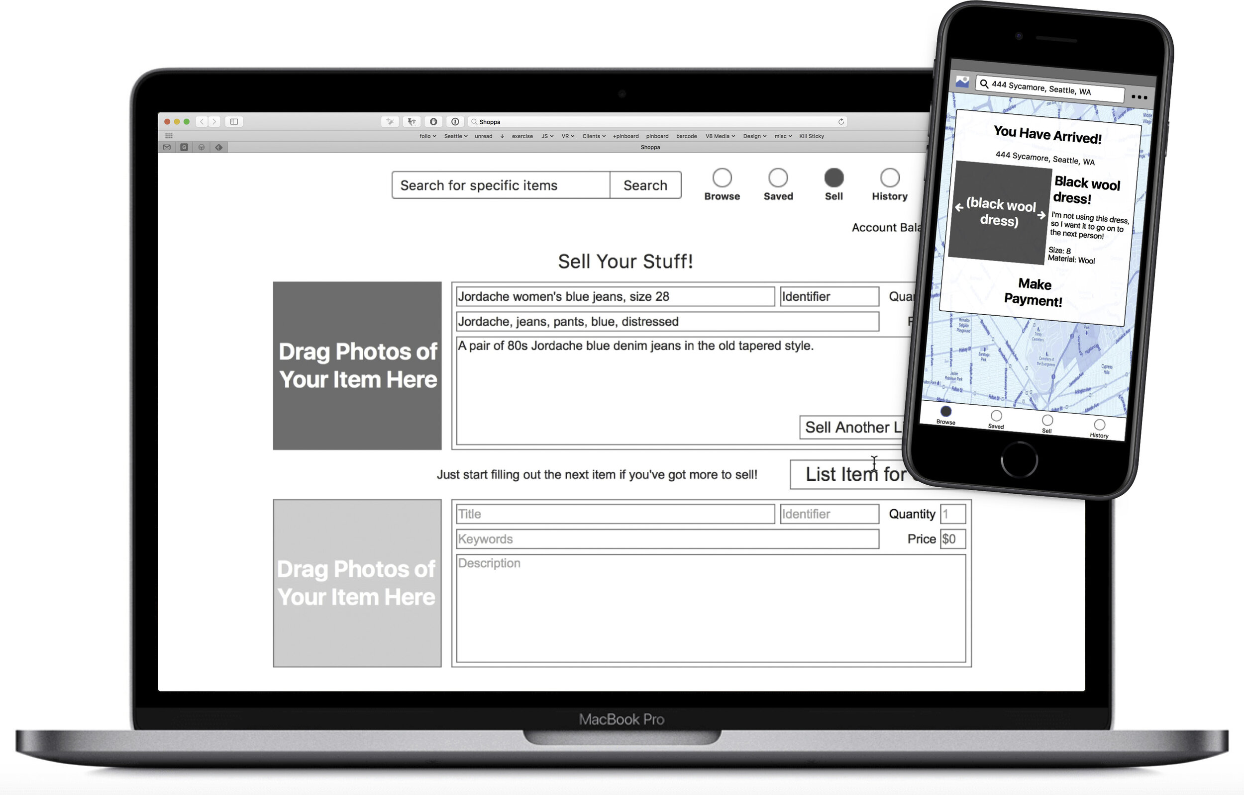
Desktop and Mobile Prototypes
Project
The project involved creating wireframe designs and low-fidelity prototypes for both mobile and web versions of an end-user auction/sales site with some additions and rethinks.
Challenges
Which sales features from other platforms could be used to extend current personal auction sales sites
What features would provide benefits to buyers?
Role
As the sole designer and prototyper for this project, I was responsible for sketching, storyboarding, designing user flows and information architecture of the technology, and building low-fidelity interactive prototypes for both desktop and mobile.
Process
Sales sites like eBay allow users to see previous sales individually, but there aren’t ways to compare multiple sales. Even a user who only sells 10-20 items per year would benefit from a view representing where they made their money. This would allow someone to focus their efforts vs the potential reward.
Another important detail is the idea of "continuing on" instead of manually having to go add another item for sale. The user could either list another of what they're currently looking at, or start typing into the fields below the currently viewed item.
Axure was used for both the web and mobile prototypes for this project because it provides reasonable management of many interactions.
The first sketch illustrates how the user can see all of their items, both for sale and sold, in the same location. Comparing with eBay, users often have to click back and forth between different sections to keep track of items that need shipping, re-listing, or are waiting for a buyer.
The 2nd sketch is an illustration for how a continuously scrolling interface might allow the user to get details of the items scrolling by.
Another step was the creation of information architecture documents. OmniGraffle was used for this software's ability to keep items linked together while working on relational/flow diagrams.
Learnings & Future
To test the concepts and basic feature ideas, interactive prototypes were created for both web and mobile. Testing the purchasing side of the app on mobile devices would be the best place to start, as it is likely the larger market. Basic usability testing would help make it clear whether concepts make sense to the user in terms of navigation and information architecture. This would be important work to do before moving to design and development. For example, it could take changing out the placeholder images for actual images of items for sale to help users recognize or decode the basic interactivity.
Outcome
To try out the mobile app prototype, click on this link. Please note that the prototype illustrates a user path. If you select the green rectangle and cursor icon at the top left, you can see the interactive elements visible on each screen.
To try out the desktop browser prototype, click on this link. Please note that this prototype mostly illustrates a user path. If you select the green rectangle and cursor icon at the top left, you can see the interactive elements visible on each screen.


